It can be difficult to find the right Financial Advisor websites. It can be hard to choose the right Financial Advisor Website design. This is why we created this list 41 of the best Financial Advisor Websites. We hope you enjoy it!
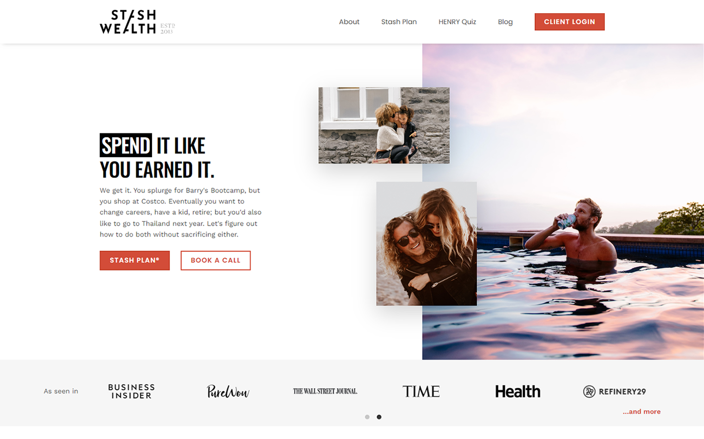
1. Stash Wealth
It works because the website uses the same black-and-red color scheme. Graphics, text and language are used to target the audience. Social proof, such as testimonials and reviews, can be used to establish confidence.
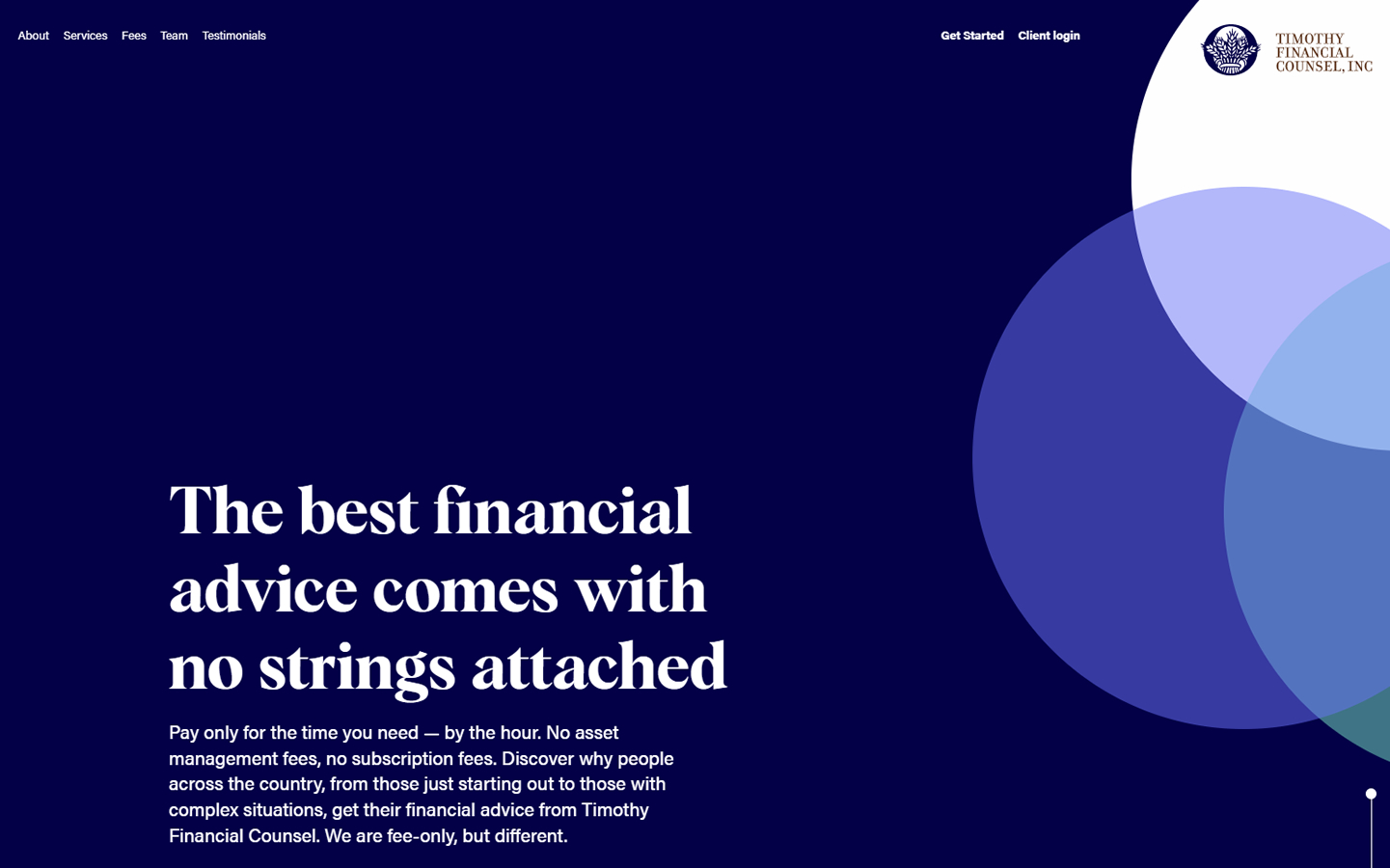
2. Timothy Financial Counsel
It works because: The homepage is easy to use. A single animation is used to create the hero. This animated element can then be transformed into an interactive graphic element. The use of colors suggests a formal and professional business.
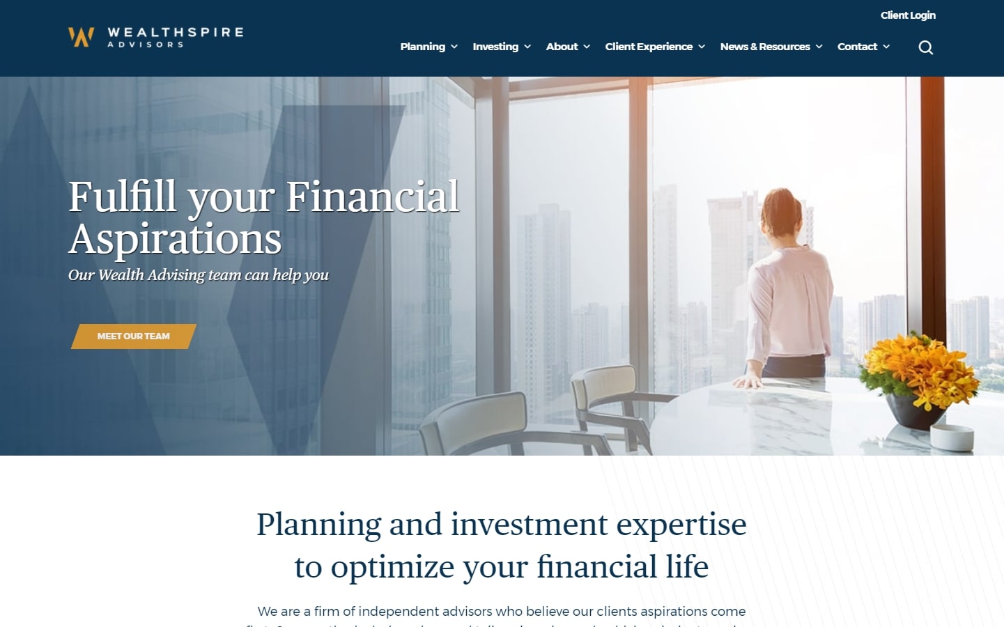
3. Wealthspire Advisors
It works because blue and yellow are consistently used efficiently and effectively. Based on the company logo’s angles lines, angle lines, boxes, and design components are used throughout all sections of the website.
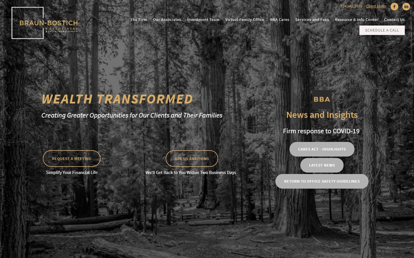
4. Braun-Bostich & Associates
It works because: The financial advisor website directs users to the correct page by offering multiple portals on its home page.
DESIGN OF A WEBSITE FOR FINANCIAL SERVICES
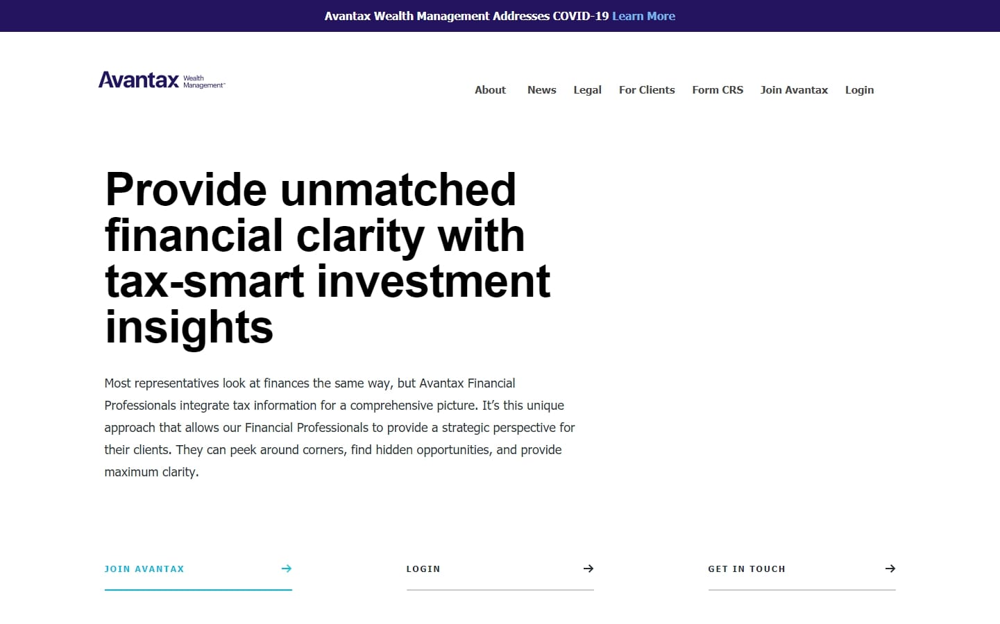
5. Avantax Wealth Management
It works because: The website is professional and clean. The website has a lot more white space than it needs, large pictures and bold headlines. The use of colors is limited to the clickable elements and the absence of images in the hero section.
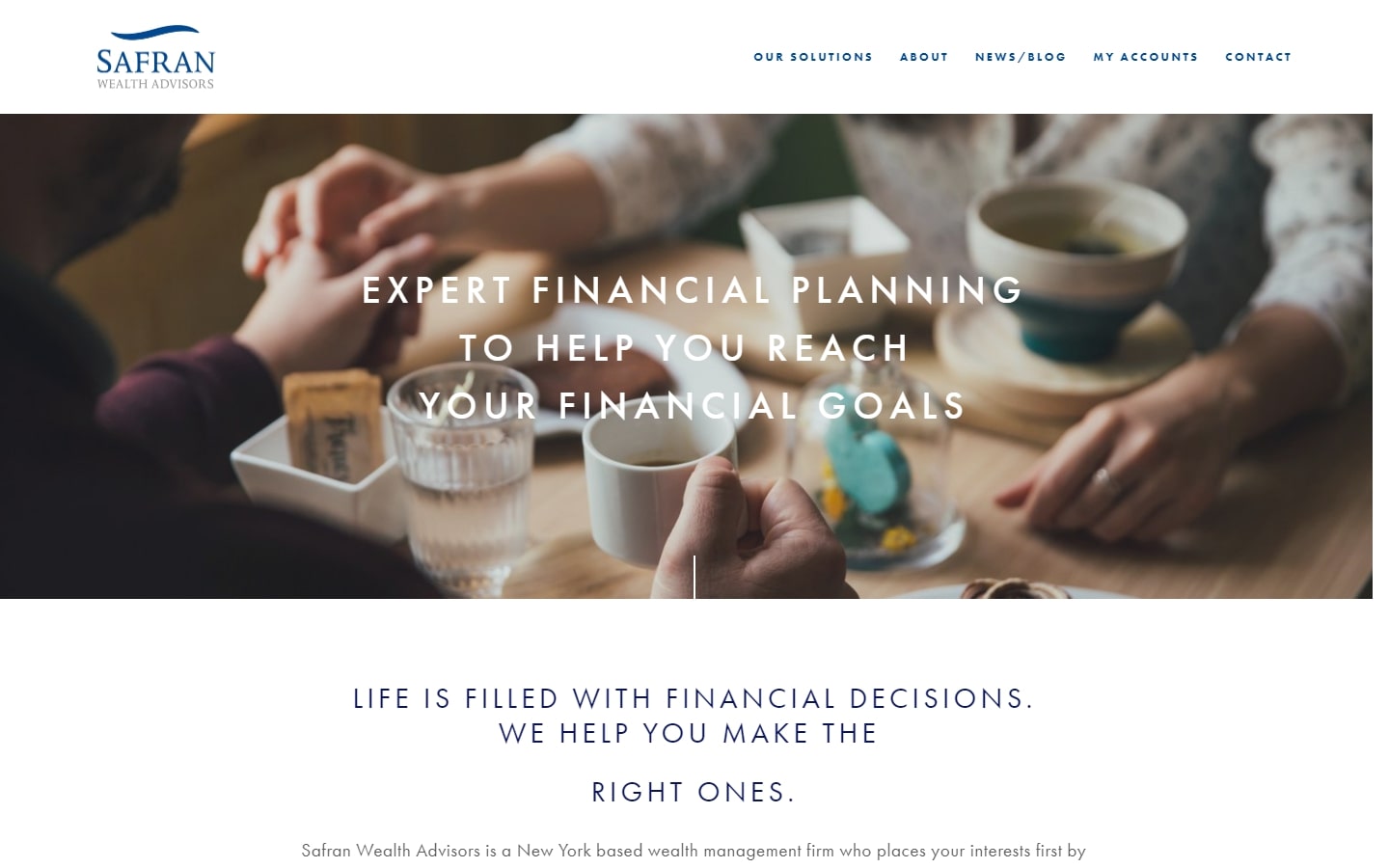
6. Safran Wealth Advisors
It works because the typefaces used on this website are very trendy. These fonts are often found on fashion-related websites making them unique to other financial advisor websites.
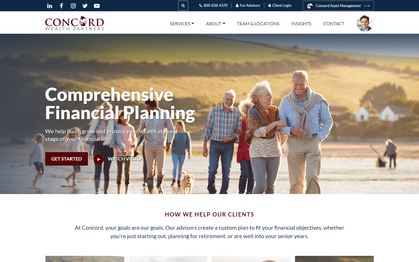
7. Concord Wealth Partners
It works because the site layout is optimized to increase conversions and user-friendliness. It has a beautiful spacing between design and content components. Clickable links are provided for the photos to open new pages. The design is fresh and modern.
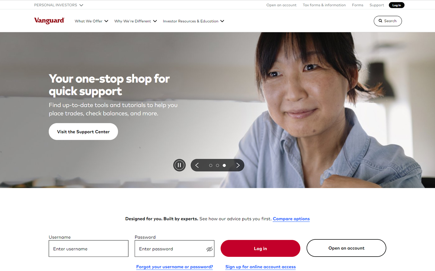
8. Vanguard Group
It works because the video testimonial section is very well made. The site loads fast despite the use of many high-resolution images. A well-organized website that provides a lot of information. Thanks to the sitemap and dropdowns, the site is easy to navigate.
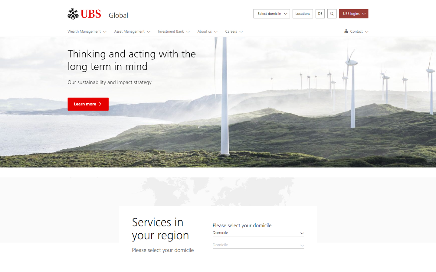
9. UBS Financial
It works because: This website is completely light and simple. Only the logo and call-to-action buttons are highlighted in color. You can also find language-specific versions of the site.
BEST FINANCIAL ADVISOR SITES
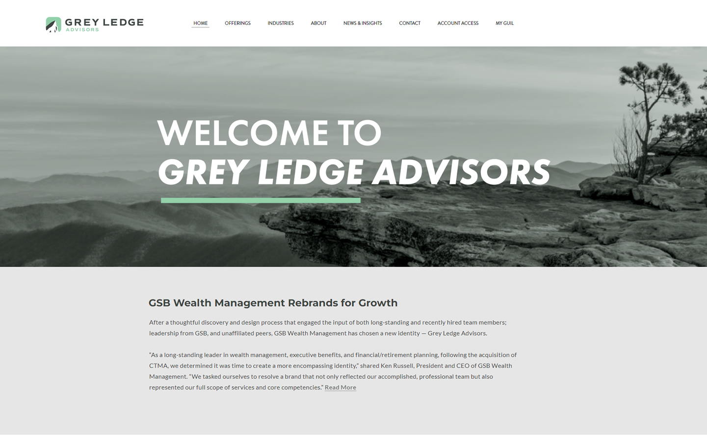
10. Grey Ledge Advisors
It works because: Serif headings and non-serif content are used in this website to enhance professionalism. You can further enhance this effect by using significant negative spaces. Parallax scrolling is another way to increase the site’s appeal.
11. Ariston Services Group LLC
It works because: The homepage is visually appealing thanks to the use of high-resolution videos in the hero section. This website used professional, but pleasant-looking fonts.
12. Carson Wealth
It works because: The homepage has a clean, organized appearance that makes it easy for users to navigate. Even against a dark background, the text is easily read by using light colors. The color scheme is evident in all photos.
13. Guide Financial Planning
It works because: The homepage of the company is not just intended to showcase its services but also establish trust. The company’s credibility is enhanced by the “as seen from” video section, logos of members and affiliates.
14. Pension & Wealth Management Advisors
It works because: The site is well-organized and clean in terms of content alignment. Consistency and coherence are enhanced by the use of only blue and its shades. Site visitors will enjoy the attractive fonts.
SITES FOR FINANCIAL ADVISORS
15. ZUK Financial Group
It works because website visitors feel at ease and relaxed from the moment they land on the financial advisory website’s homepage. It is easy to read because of the clean fonts and line spacing.
16. R&J Financial Partners
It works: This is a beautiful hero video. Simple, straightforward homepage. The footer contains contact information.
17. Goldman Sachs
It works because there is no clutter and white space that distracts from the information. Website visitors are encouraged and motivated to contact us by placing a call to action button at each section as well as a contact page near the bottom.
18. Nelson Financial Services
It works because it has beautiful images and clear statements. This website is focused on financial advisors and the services they offer.
19. RLS Wealth
It works because: This wealth management website uses modern techniques such as striking images and bright colors, despite its simple layout. This website is unique in its use of color, which sets it apart from others in the industry.
BEST FINANCIAL ADVISOR WEBSITES
20. Sverica Capital
It works: This financial advisor website makes use of white or negative space. The logo design is reflected in the distinctive iconography. The homepage areas are clearly defined and well-structured.
21. Bull Moose Retirement Planning Co.
It works because: The overall design is minimalistic in terms font usage, image selection and iconography. It is possible to capture email addresses from potential clients by placing it near the footer.
22. Sabine Financial
It works because: The website’s design is clean and professional. They cleverly use white space to highlight key information. You can also find a Spanish-language page that is ideal for reaching new clients.
23. Clark Asset Management
It works because: The hero image is clear and has a sky at the top, which creates a stunning backdrop for navigation elements and the logo. Calls to action for ‘Retire Soon?’ and ‘Already Retired? are suited for older consumers, who are their target market. You can even watch free videos to explain why signing up for financial services is a wise decision for new clients.
24. Illumint
It works because: The site’s unique narrative is dramatized by the looping full-screen video and changing heading text. Despite its small content section, the content can be organized into many blocks that tell a story.
SITES OF FINANCIAL ADVISOR
25. Good Financial Cents
It works because: The website is clean and has a great color contrast. It has a picture of the founder of the company, which gives it credibility.
26. Krause Capital
It works because: The hero section includes attention-grabbing value proposition text and large images background. Both the logo and the call to action button are clear and obvious.
27. Humanitas Financial
It works because: The financial advisor website used a simple navigation bar that is sticky to ensure key information are always visible as visitors scroll through the site. The site has a friendly atmosphere thanks to the cheerful colors and the smiling faces.
28. Financial Synergies Wealth Advisors
It works because: The visual contrast between dark and light sections allows for information to be broken down into smaller pieces, which is ideal for scrolling long websites. Subtle animation effects can be used to enhance the aesthetic appeal and impact of scrolling.
29. C.L. Sheldon & Company
It works because patriotic images and colors are used in order to reach their target market of military veterans. Clear and concise text sections, as well as updated blog content, are also advantages.
WEBSITES OF FINANCIAL ADVISORS FOR INSPIRATION
30. Global Financial Services
It works because: This high-resolution image of Houston, Texas’s capital city, is a great choice for this website. To make it readable, semi-transparent blocks are used. These fonts look professional and are appropriate for the site.
31. HCR Wealth Advisors
It works: After a captivating animation, the on-hover section changes the page content by clicking on the large on-hover component. This redirects to different web pages when clicked. The pages’ inner pages are well-organized and well-spaced.
32. Bingham, Osborn & Scarborough, LLC
It works because the image blocks of the hero section are asymmetrical but they appear well-organized due to their confinement within rectangular compartments. The team section uses the same principle, but the photos are clickable and have a mouseover function.
33. Riviera Capital
It works because it is professional and clean. Dark filters are used over images to make text legible. However, text is still easily readable regardless of the reduced fonts.
34. Newground Social Investment
It works: A beautiful backdrop of full-screen images for the Hero section. They include an introduction text and a welcome video. This adds a personal touch. A section for partners and affiliates is included to further strengthen the company’s credibility.
SITES OF FINANCIAL ADVISOR
35. American Advisors
It works because the colors of red, white and blue, along with the imagery, are all connected to the company’s brand. Sidebars that can be clicked directly from a page reduce the need to open additional pages in order to display additional content.
36. Bragg Financial
It works because: This website is a financial advisor website. It uses simple animation effects and subtle background graphics. We used professional, but pleasant-looking fonts. Beautiful photographs of the location and surroundings were also featured.
37. LPL Financial
It works: LPL Financial’s website uses alternating light and dark sections. As you can see in the news section, their content is frequently updated. The inner pages are different from most financial websites.
38. The Colony Group
It works because: The homepage of this site features a huge hero background video and big hero heading text. Graphic elements and images work well together. The sticky navigation makes it easy to see the navigation even after scrolling.
39. Half Dome Capital
It works because the home page is visually appealing. It is striking against dark backgrounds and light backgrounds because of the orange hue used in the call-to-action buttons and heading text. This makes it very effective.
WEBSITE DESIGN FOR FINANCIAL ADVISOR
40. Merril
It works because: The video in the section “Hero” adds visual representation to the main headline. The use of subtle shadows and the overlapping of sections add depth and layering to the overall design.
41. David Rewcastle
It works because: The website is filled with helpful financial content and real interviews with prominent publications. The blog is well-optimized and covers important topics. The David Rewcastle website layout is clean and easy to navigate.
Conclusion
We are grateful for your interest in our blog. Contact us if you are looking for a website that specializes in financial app marketing. Our designers are available to help you make your vision a reality. They will create beautiful designs that will increase customer conversion rates.
Before you sign anything or pay, we will create a mockup of your website. You don’t have to sign anything and you won’t need any payment information. We can work together if you like the design we have created for your business. There are no hard feelings or other obligations if you don’t like our design for your business.

